
The World Health Organization’s open data
The World Health Organization (WHO) is well known for its work in health and wellbeing at a global level.
WHO also collects and publishes an enormous amount of data that can be viewed and easily downloaded for re-use. The WHO covers a wide range of topics, including:
For most of these areas, the information is broken down on a country level, and can be viewed as graphs, charts, map visualisations and/or raw data in a table format. This raw data can then be downloaded.
We thought we’d take a deep dive into a couple of the datasets.
Air pollution
The air pollution datasets cover many different types of metrics across ambient air pollution, air pollution and disease, and air pollution and mortality rates. The default view for the datasets are maps, so you can see different problem areas across the globe. For example, the pollution measurement indicator of ‘concentrations of fine particulate ’ clearly shows pollution problem areas across most countries in Africa (e.g. Niger, Mauritania, Nigeria, Chad and Cameroon) and Asia (e.g. Nepal, China, Mongolia, India and Saudi Arabia). Happily, Australia has one of the lowest concentrations of fine particulate matter.
Vitamin and Mineral Nutrition Information System
The Vitamin and Mineral Nutrition Information covers different micronutrient indicator maps and data. You can select a nutrient/indicator, such as calcium, fluoride, iron, Vitamin A and Vitamin D and then view the raw data as a table that can be downloaded as an Excel or CSV file.
You can also view micronutrient . For example, you can search on Vitamin D. The filters display what data is available (e.g. children, adults, etc.) and when you click on the search icon you get the map visualisation. In this scenario, it’s easy to see that Vitamin D in adults is lowest in Mongolia and Iran.
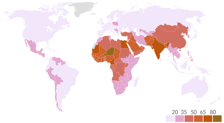
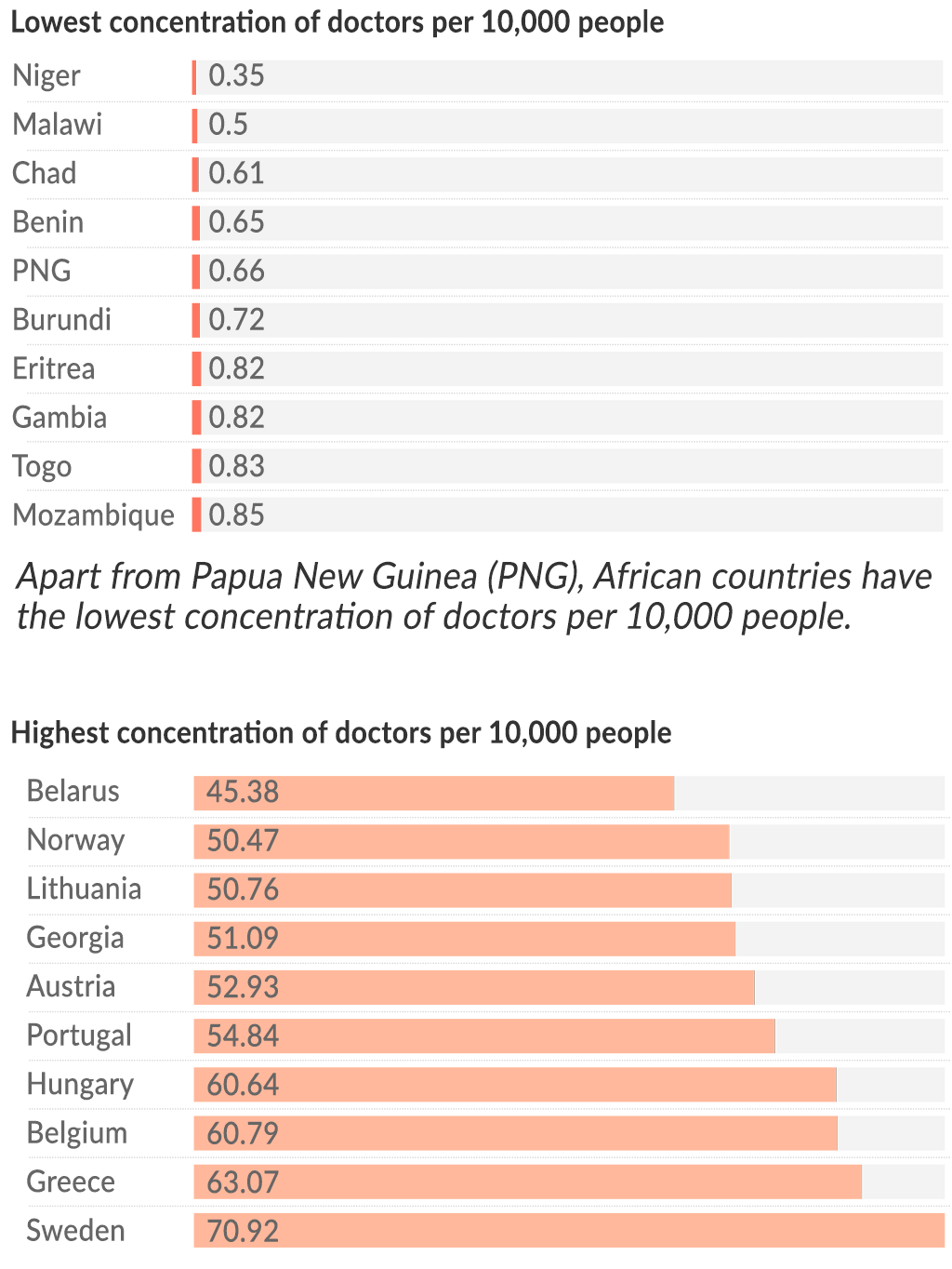
Medical doctors per 10,000
Another interesting stat is the section that looks at the health workforce in each country. This covers medical doctors, nurses/midwives, dentists, etc. For example, looking at medical doctors, stark differences between countries are immediately obvious. In 2020, these are the numbers of doctors per 10,000 people:
Mozambique — 0.85
Ethiopia — 1.06
Afghanistan — 2.54
India — 7.35
Australia — 41.29
Belgium — 60.79
As you can see, it means if you’re born in Belgium going to see a doctor is roughly 60x easier than in Mozambique or Ethiopia.
WHO insights
WHO also produces special , analysing a variety of different data. Some of the more recent insights include:
World Health Statistics — Covering a variety of different metrics across the world, including the impact of COVID, life expectancy, leading causes of death, malaria, tuberculosis and HIV incidence rates globally, and universal health coverage
The 2020 SCORE — An in-depth look at health information/data systems around the world (SCORE stands for survey, count, optimise, review, enable)
The Triple Billion — Metrics that track WHO’s goal to transform the future of public health