Site accessibility
Site accessibility is an important part of building a website. You want your website to be used and enjoyed by everyone, but not everyone will access the site in the same way. We interact with websites through sight, sound and touch, but we need to allow those with limited capabilities in these senses to still have a good experience.
Just like you never appreciate your health until you're sick, it's easy to forget about accessibility during development when the site works fine for you. It's important to keep an inquisitive mind during development.
Think of the following:
Sight:
- How would a colourblind person use your website?
- How would a person who forgot their glasses use your website?
- How would a person with cataracts use your website?
- How would a person with no sight use your website?
- How would your site display on a projector in a well-lit room (low contrast)?
- How would your site display on a mobile or laptop at low screen brightness?
- How would your site display if a person was using a browser extension to alter your site's colours to a 'dark mode' to reduce strain on their eyes?
Sound:
- How would a person with poor or no hearing understand videos or audio on your site?
- How would a (polite) person with no earbuds on a train understand a video without turning their mobile volume up?
- How would a person at a public cafe/internet kiosk understand your video with no speakers?
Touch:
- How would a blind person navigate your site without a mouse?
- How would an elderly person with limited dexterity use your site?
- How would your site be navigated on a tablet using touch input?
- How would your site be navigated on a game console using a controller?
As site developers we like to imagine that we dictate the user experience — but there are so many variables that affect how the site will be consumed by any one of the millions of unique visitors, each with their own needs and habits. How do we make a site for everyone?
Keeping your website simple is the best way to lay a solid foundation for good accessibility. The more interactivity and customisation you introduce, the more maintenance and testing, and the higher the risk of making your site inaccessible.
Below is some detailed information on different aspects of web accessibility. You may like to jump ahead to one area using the links below:
W3C Web Content Accessibility Guidelines (WCAG) 2.0
The World Wide Web Consortium (W3C) develops international standards for the web, across areas such as accessibility, HTML and CSS. Led by the inventor of the web, Tim Berners-Lee, the consortium is made up of member groups, the public and full-time staff.
The W3C runs the Web Accessibility (WAI), which specifically focuses on web accessibility. Part of this is the W3C’s Web Content Accessibility Guidelines (WCAG), a global directive on best practice when it comes to accessibility. WCAG is still widely used, however last year WCAG2.1 was released with additional success criteria (see What’s New in WCAG ). These standards/guidelines are used in many different countries across both corporate and government sites. Within these guidelines are three levels:
- A
- AA
- AAA
For government, accessibility is often mandated in policy documents, as part of the government’s responsibility to ensure content is accessible by all citizens, and AA is often the required standard.
The DTA’s Digital Service Standard
In Australia, the Digital Transformation (DTA) is a federal agency that’s focused on improving digital services across all levels of government in Australia. As part of this, the DTA has published its Digital Service , which sets out 13 items that will help government deliver better digital services. Number 9 is Make it , which specifically calls for federal sites to meet WCAG 2.0AA.
Who should know about accessibility?
In a web development team, it's a bad assumption to think that accessibility should only fall onto the shoulders of developers and testers. Accessibility is affected by everyone, so everyone should know how their decisions affect accessibility.
Designers who dictate the user experience will also force decisions on development that can affect accessibility. A designer should have a developer’s mind — think 'how will my design translate to code, and is that going to be viable?'
Project managers and business analysts who decide what features should be included also affect the accessibility based on the requirements they agree to, and the tickets they write.
Backend developers who can often influence the markup that is placed on the page and frontend developers who introduce interactive features all need to be mindful of accessibility at all times. Finally, testers also need to be across accessibility issues and need to test to make sure things work everywhere.
Every decision made can affect accessibility, and therefore every person making these decisions should do so with a knowledge of how this will affect site usability.
Getting some help
While careful thought and consideration will help craft your site to be accessible, it can be very easy to overlook even things that you know are wrong. Tools can be an important part of testing to help pick up things you may miss the first time around. The below tools will help you.
Powermapper
A site auditing tool, Powermapper SortSite combines code validation with link checking and accessibility tests. While it does cost for a license, it’s a comprehensive check and will pick up a lot of things that can be missed.
Screen readers
Checking statistics on screen there are three key players in the screen reading software space — JAWS, NVDA and VoiceOver.
Of these, is the second most popular and is freely available for Windows. This should reduce the barrier to testing your site on screen readers.
While not used widely, if you're a Chrome user there's which will perform a quick check of your site's readability.
Dev tools
Chrome, Firefox, Edge, Internet Explorer and Safari all provide development tools that can be used to inspect your site's markup, styling and scripts. Chrome also provides extensive auditing tools that takes performance testing to the next level.
 |  |
Screenshot of performance auditing (left) and accessibility (right) tools in Chrome.
WebAIM colour
A basic but effective way of testing contrast on a site — the colour checker takes in two colours and informs you of their accessibility compliance.

Contrast checker showing a contrast below the required AA threshold (except for large text).
Sim
This application allows you to overlay a window on your desktop and see your site through the eyes of a colourblind person. A good test for designs to ensure that chosen colours are still legible for the colourblind.

Web
A utility belt of tools for testing various features of your site. One particular favourite is 'View Document Outline', which shows nesting of heading elements on a page.

Quick tips
Below are 10 handy tips to improve your site’s accessibility.
Headings should sequentially indent
Screen readers like NVDA allow you to press the H key (and Shift + H to go backwards) to jump between available headings. This makes headings an important navigational element — when you jump to a heading you want to know if the heading is related to the one before, or opens up to a new topic. The nested heading levels provides that relational information.
 |  |
Good indent. Structure and headings are meaningful. | Bad indent. H1 "Register." is the same on all pages. Missing headings between levels. |
2. For expandable/collapsed elements use ARIA expanded
Building interactive components like accordions is great for hiding information to allow for easier digestion of information, but whereas accordions to sighted users are indicated through design cues (making an element look like a big button), screen readers need that information read out. This is where ARIA (Accessible Rich Internet Applications) tags come in handy. 'aria-expanded="true / false"' provides information about the state of the accordion when the accordion heading button is given focus. This label (along with others) is only for screen readers, so they can be used in many ways to convey information about the workings of custom components.

An example of a simple accordion using aria-expanded.
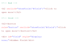
3. Avoid using links that don’t link (href="#")
A common misuse of an <a> is to add a blank hyperlink reference (#), have javascript prevent the default behaviour and instead trigger some other function on the page (e.g. show a new popup on the page). A better option would be use a <button> element. <a> elements are links, and are expected to link somewhere — screen readers will identify them as links. Categorically, <button> is a better fit for triggering an interactive feature.

Top: Anchor with hash ref and return false to prevent link being followed.
Bottom: Button to do the same thing, minus the baggage.
4. Avoid adding interactive events on non-interactive elements
As with the above point, a heading is not interactive by nature; focus is not given to it on tab, and while we can trigger click events on it, it's bad for accessibility. It's good to think of what element will semantically suit the situation. E.g. "If I click it and it goes to a page, it's a link (), if i click it and it performs some in-page change, it's a button ()." Use interactive elements for interactive features.
5. Your entire site should be navigable using only a keyboard

Sample keyboard shortcuts for navigation in NVDA. Taken from . Further reading:
6. Is focus visible?
When tabbing through the site you should be able to tell where focus is given (the focus indicator shows where the tab/cursor is). Contrast helps this too. If Chrome gives a blue outline, it will be hard to see on a blue background. Focus rings can be changed on a per element basis so changing it to suit the situation can help visibility.

Example focus rings on elements. Note the blue-on-blue has a low contrast and is difficult to see.
7. Is there too much text in a single link?
For example, if you’ve got an image, heading, summary, and a read more button and it’s all wrapped by a link, a screen reader will read everything out. Use ARIA tags for screen readers to give more context for audio that screen readers read out.

An example of a lot of text captured within a single link. ChromeVox would read as:
"Key calendar dates 3 April Term two starts It’s back to the classroom as school start term two on the 16th April. 23 April ANZAC Day National day of remembrance to commemorate the ANZACs. See the events calendar. Internal link."
8. Use <ol> and <ul> for all lists
Many things are lists and it’s best to use <ol> and <ul>.This helps with tabbing because a screen reader will say item 1 of 10, item 2 of 10, etc., which helps orientate the user in your page.

Google's search results display using <div> elements...

...while Bing uses <li> list elements for its results. What does this mean? Which one is correct?
9. Forms and errors often have poor accessibility — keep it simple!
Forms can be hard for screen readers but if you add focus to the first field and add an error inside the label so it reads out the error associated with a specific field, that helps visually impaired users.

Example markup to illustrate how an error can be placed for screen reader convenience.

Thoroughly check third-party form widgets. Often they can have poor accessibility. It's best to stick to standard form elements instead of using a custom one.
10. Keep iterating and checking your site for accessibility
Remember, every time you add more content it can affect accessibility so it’s a good idea to regularly review your site’s accessibility and keep all of the above tips in mind when updating your site.
Have you been tested?
You've built your site, you've tested with tools — so my site is accessible now, right? It could very well be. But if you want a second opinion, there are auditing services out there, such as Media Access , that will check your site and provide an assessment with key areas to fix. Audits will cost, but they can provide you with a second opinion that will either validate your decisions, or help improve your accessibility.
Final comments
Technology changes; enabling more ways for people to interface with their digital life in various ways. Whether through artificial intelligence (AI) voice interactions, or eye-tracking software, it's hard to say what new technology will come out tomorrow and turn accessibility on its head. But as long as people are building experiences for others, there's great value in taking the all-inclusive approach.