It is a question that is asked of Web Designers perhaps more than any other. What aspects of a website make for great design? Well, here's a few top tips using a site we've recently designed for a Melbourne based client as an example.
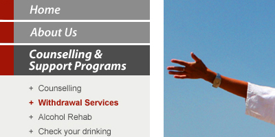
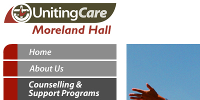
1. Clear navigation structure
Do visitors know where to go to get the information they need and can they get there easily? Ensure your navigation uses language that is easy to understand and is hierarchically organised according to the type and importance of content.
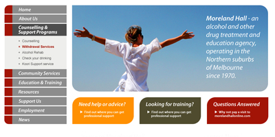
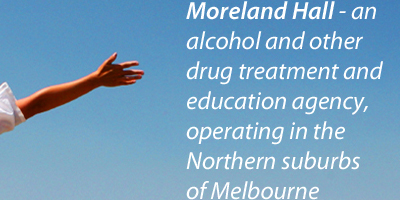
2. Engaging and relevant imagery
A website without imagery is almost like a pub without beer – bland and unmemorable. That said, getting the imagery right is also crucial. Select imagery that is directly relevant to both your brand and target audience (if you can afford a few extra dollars custom imagery is best).

3. Text – dynamic, legible, accurate, brief
The heading says it all. Ensure that text on your site is spelled and punctuated correctly, updated often, is of a size large enough to be read by the average person with average eyes and is written with brevity in mind.
4. Simplicity
There is nothing worse than a site that has been over-designed and is cluttered/crammed with information. Keeping your site clean and simple yet engaging will ensure that visitors have as positive an experience possible and aren’t scared to return.
5. Embrace the space!
As per the above point, there is nothing wrong with the strategic use of white space, particularly if there is a product or service you want to place more emphasis on.

6. Web-optimal typography
Web browsers generally favour the use of a standard set of fonts/typefaces so if these are used consistently throughout the site, you are more likely to ensure your visitors see what you see! Google actually publish a list of open source you can use in your website that they support.
7. Use colour wisely and appropriately
Colour is best used strategically and in close alignment with the brand of your business. If the nature of the business necessitates colour (think kids websites etc) then you can afford to be a little more liberal, otherwise it’s best to keep it nice!
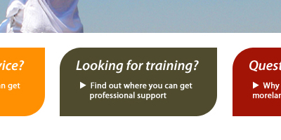
8. Call to action
It is always ideal to have some aspect of your website design function as a call to action – be it to find out more about a specific product or service or send an email enquiry. Getting visitors to interact with your site in some way is crucial.
9. Searchability
Can users search for something on the site if they choose to and will they get accurate and useful results? If the answer is yes, you’re on the right track. If no, time to get cracking with implementing a search function.
10. Testing 123
This is where so many websites that have been designed with the absolute best of intentions can go horribly wrong. Testing. It is absolutely vital to try and break the site on every browser and platform before it goes live. It’s a bit like a restaurant with a dirty bathroom – despite the food being okay it has the potential to completely ruin your experience.
- No image for this as all our sites work perfectly, of course! -